Every experience matters:
Hearing directly from patients to inform a new brand identity
In collaboration with the Patient Ombudsman
A new office was established to investigate complaints about health care experiences in Ontario. To launch its new identity, we listened to those who would be most affected—patients and caregivers.

Challenge
Health care experiences are deeply personal—what matters most to our system’s most vulnerable? How might we present the brand as a fair and impartial organization – one that does not take sides?Solution
To understand what matters most to Ontarians, we led consultations with patients and caregivers across the province to better inform the brand name, positioning and visual identity.Scope of Work
Stakeholder consultationsBrand identity and positioning
Brand guidelines
Bilingual communications materials
The context
The Patient Ombudsman is a new office established to investigate complaints and facilitate solutions about health care experiences. As an “office of last resort,” the Patient Ombudsman listens to all sides to try to resolve complaints. It also investigates and highlights trends and patterns and makes recommendations to tackle system-wide problems.
We held four consultations across Ontario with patients and caregivers of different ages, abilities and backgrounds.
Listening to patients and caregivers
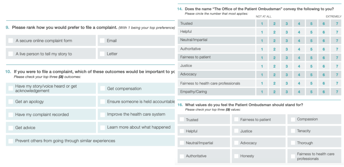
We wanted to understand what mattered most to Ontarians and hear personal stories of their own unique challenges and experiences navigating the health care system. To develop our identity, we held four consultations across Ontario with patients and caregivers of different ages, abilities and backgrounds.
Our research was also supplemented with 619 responses to an online survey. These insights let us know what Ontarians expect from the Ombudsman.

Creating the brand positioning
Several themes and patterns emerged from the sessions. We heard that people:
- Want to be treated with respect and fairness.
- Want their complaints to prevent others from going through similar experiences.
- Believe complaints should be used as data to drive change.
“Often, it’s good enough to be listened to—you just want to be heard.”
These valuable insights helped define the brand, contributing to everything from the logo to the vision, mission, values statements and a new tagline: “Every experience matters.”
A visual identity rooted in trust
We needed to position the Patient Ombudsman as a fair and impartial organization – one that does not take sides. This also meant being visually distinct from the government and not affiliated with any political parties.
The logo is designed to be a colourful bridge; the office is a bridge between the patient voice and health sector organizations to drive positive change.
The arc of the bridge transitions in colour; bright blue for health sector organizations, representing credibility and trustworthiness; green for our aspirational role of having a vibrant, action-oriented and fresh perspective; and yellow for the patient voice, representing optimism, hope and shining a spotlight on issues.

Clear, simple and approachable communication
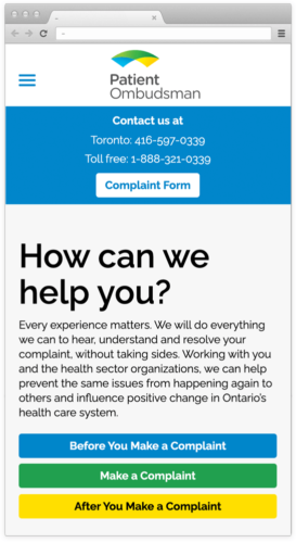
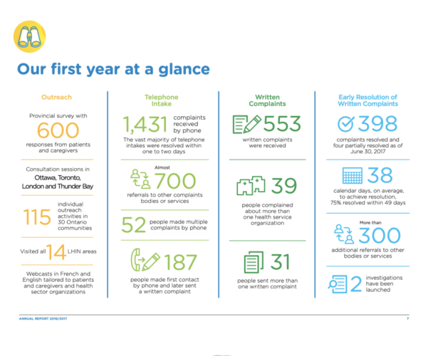
We needed to relay complex information to a diverse, multicultural and multilingual audience, often made up of vulnerable, frustrated people. This meant having to distil information and articulate a clear, step-by-step complaints process through infographics and messaging so that all of the Patient Ombudsman’s stakeholders know exactly what to expect – and at what stages.

