Context Creative — a Mod Op company
Menu
  • Medium
  • Instagram
  • Twitter
  • Work
  • Services
  • Team
  • Careers
  • Insights
  • Accessibility
  • Contact
  • Work
  • Services
  • Team
  • Careers
  • Insights
  • Accessibility
  • Contact

Keeping legal professionals at the forefront of their career

In collaboration with Osgoode Professional Development

A UX-led redesign of a legal education website created a streamlined user experience for professionals looking to sharpen their knowledge and skills.

Screen capture of the new Osgoode PD website

Challenge

OsgoodePD offers professional, graduate, international and a range of continuing education programs. How could we make it easier for diverse audiences to find the most relevant program for their needs?

Solution

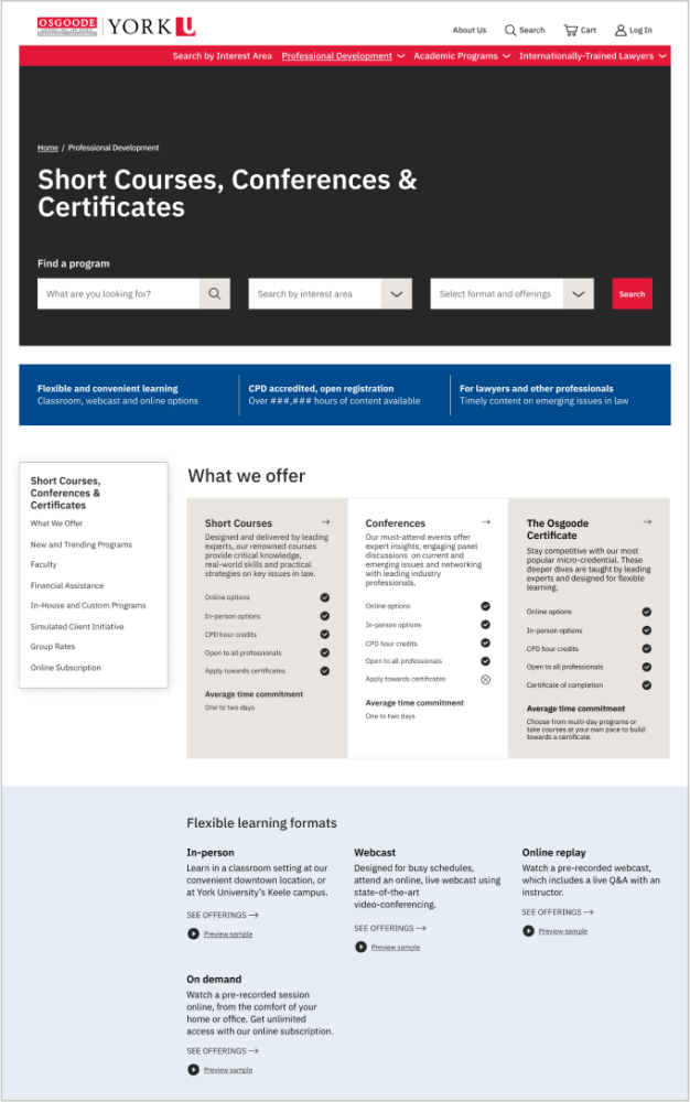
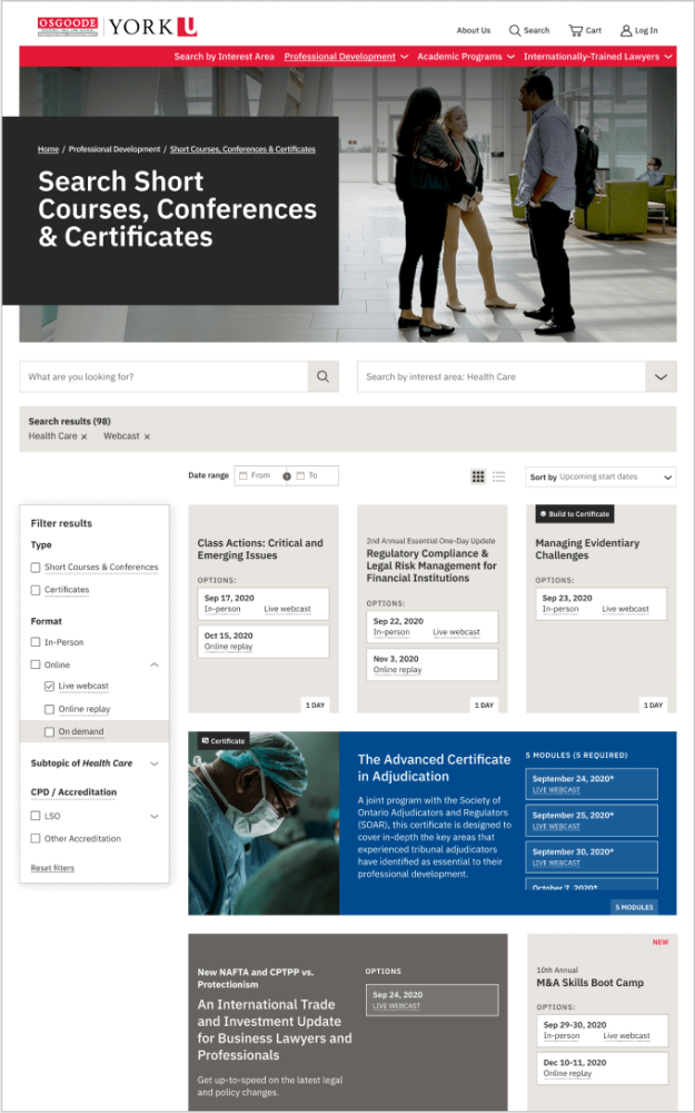
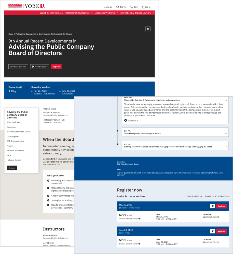
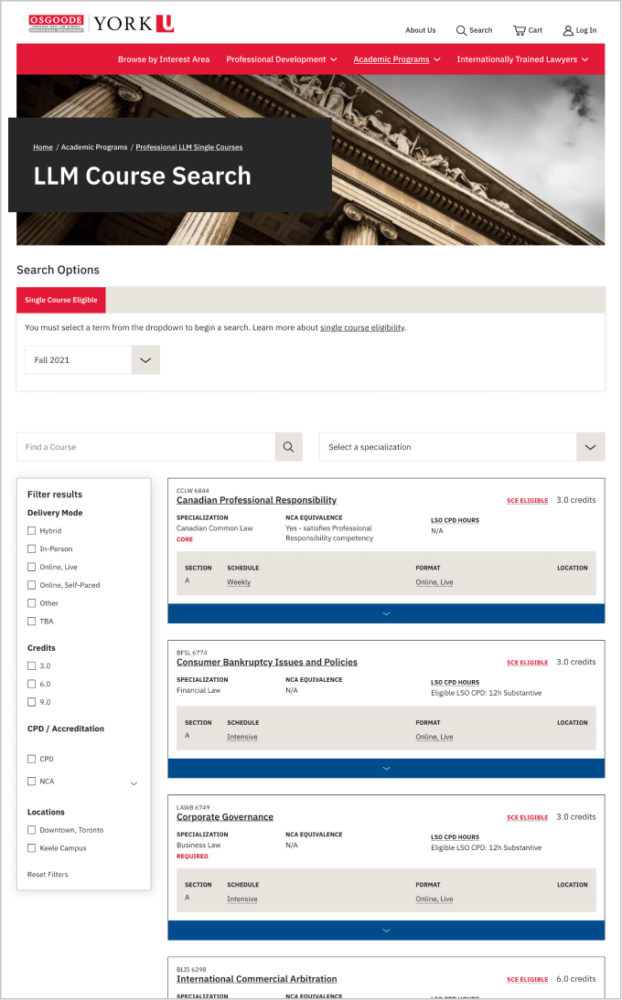
With new IA, navigation, page structure and a streamlined approach to searching and filtering programs, users can now find relevant offerings more easily.

Deliverable

Stakeholder consultation
UX and content strategy
Information architecture
Website design
User testing
Website development

The context

Legal professionals count on institutions like OsgoodePD to stay at the forefront of emerging trends and issues in their fields.

OsgoodePD is a globally-recognized leader in lifelong legal education. From continuing professional development (CPD) to in-depth academic degrees and diplomas, it delivers experiential learning through classroom or distance learning.

The website would need to function as effectively as an OsgoodePD intake advisor, helping users self-identify and guiding them to the most suitable offerings.

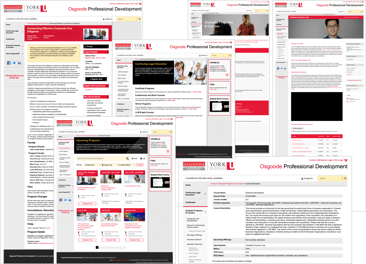
With distinct core offerings for different audiences, their website didn’t feel unified. Navigation was unclear, page structure was inconsistent and manual processes had resulted in outdated content in multiple places.

We were faced with a few UX challenges:

  • OsgoodePD serves a diverse range of professionals from across the world—each segment with unique needs and motivations.
  • From online courses to in-depth diplomas and degrees, each offering has distinct eligibility, registration, course formats and career outcomes.
  • The website used manual processes for updating program information, so each instance of content appearing on multiple pages required updating.

For the website to meet the clients’ goals, the website would need to function as effectively as an OsgoodePD intake advisor, helping users self-identify and guiding them to the most suitable offerings.

Screen captures of numerous pages of the old Osgoode PD website
A collection of screenshots from the original Osgoode PD website

Understanding audiences and the landscape

How were leading companies streaming user segments, conveying their value proposition, filtering courses and formatting course content?

We conducted an environmental scan of competitors and disruptors in the online education space to understand best practices and better inform our UX and content strategy. How were leading companies streaming user segments, conveying their value proposition, filtering courses and formatting course content?

Stakeholder consultation

After several generative workshops, including a card sorting session, with program directors and other stakeholders, we mapped out OsgoodePD’s core offerings, audience segments and key value propositions. Collaborating at this early stage helped:

  • Break down silos between teams.
  • Unify everyone towards a common goal.
  • Consolidate information to create one overarching strategy.
  • Clarify content hierarchy and priorities.
  • Reimagine content from a user’s perspective.

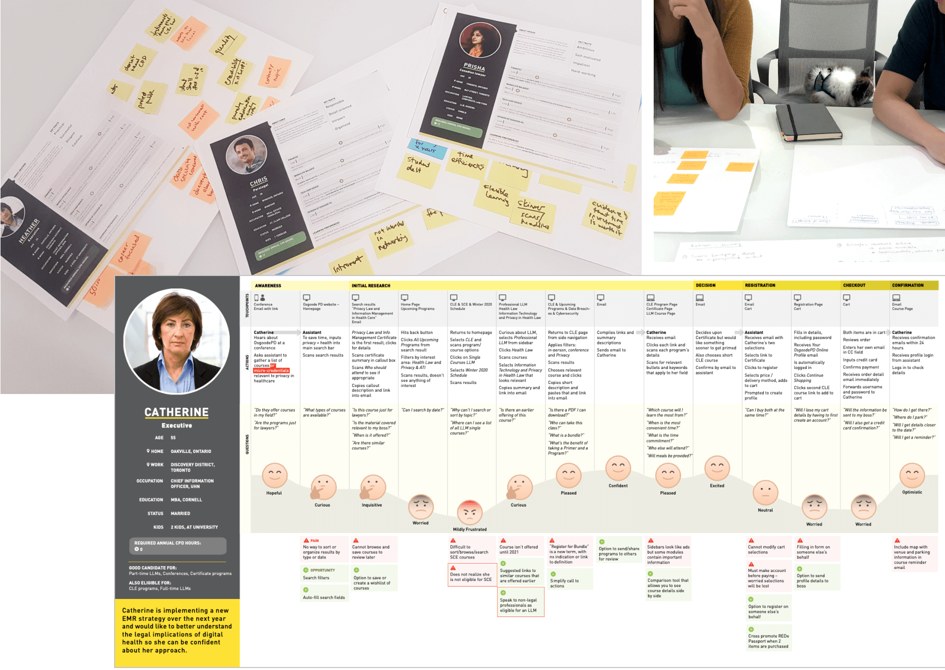
Personas and journey mapping

Given the complexity of the offerings and the many audiences, we created a booklet of in-depth personas and journey maps to map out user scenarios. For our team, they were a helpful tool to inform our content strategy and information architecture. The OsgoodePD team found them invaluable, and the booklet became a go-to reference guide during our working sessions.

Photograph of a number of people working with sticky notes on pages of different profiles of people. An image of a profile's steps going through the website and their feelings listed.

Content audit, navigation and information architecture

Here’s what we did to make the site more user-centric:

  • Conducted a comprehensive content audit.
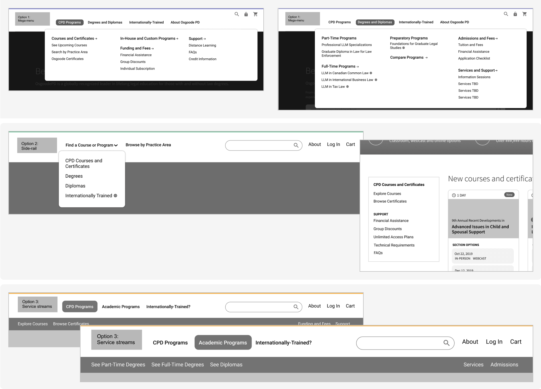
  • Established a mega menu to guide users directly to key pages.
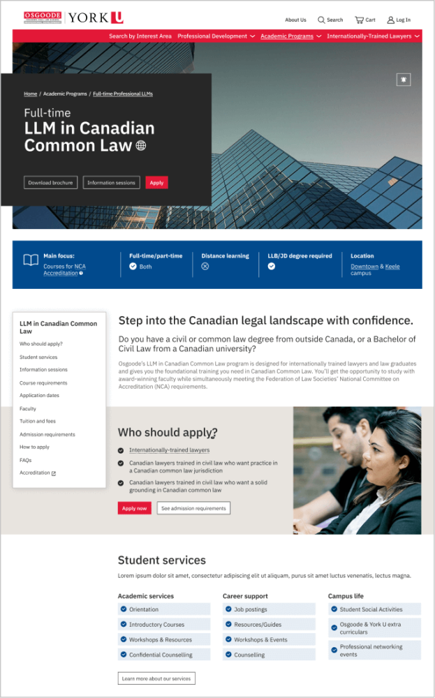
  • Overhauled the information architecture to unify the site.
  • Developed a content strategy to map all content to user journeys.
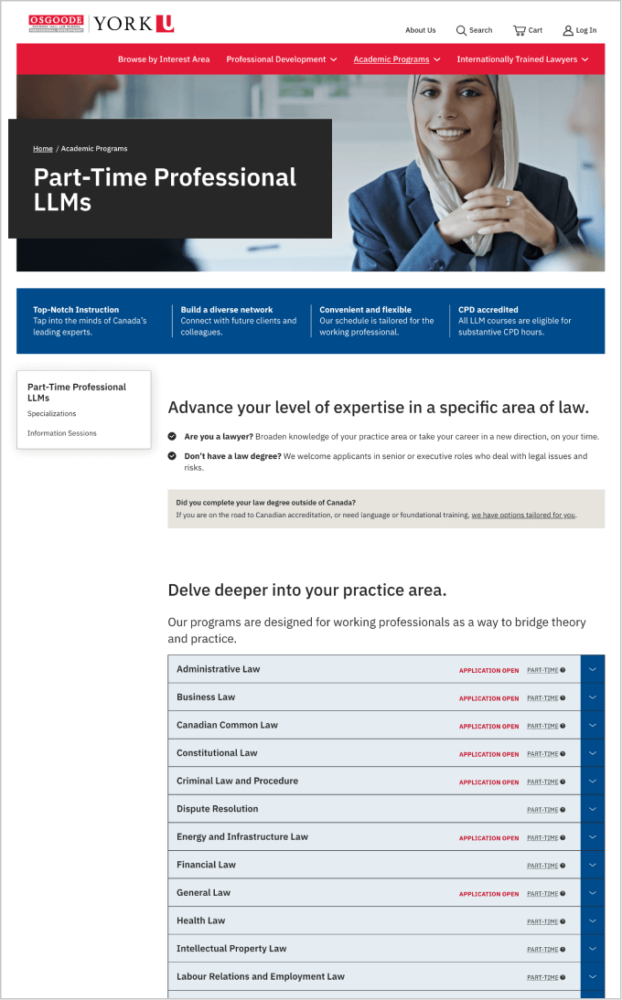
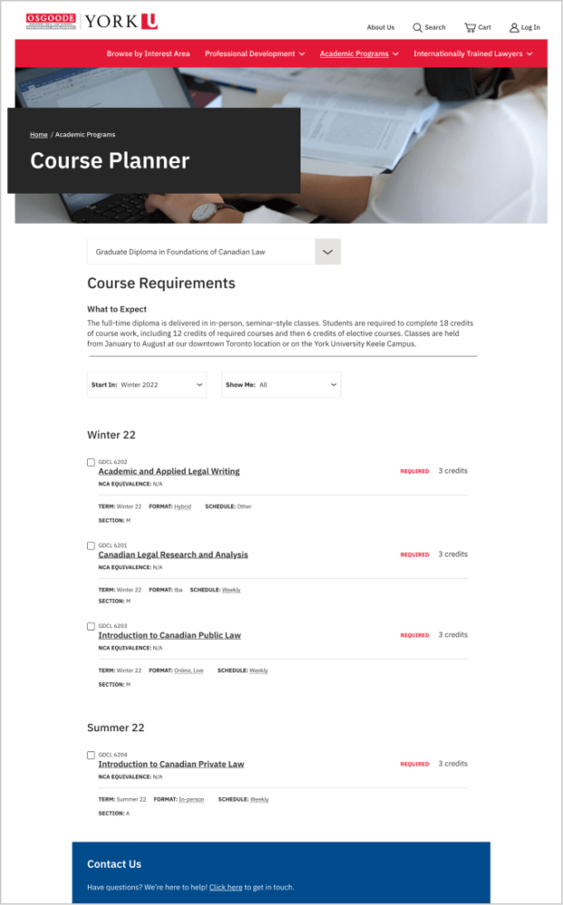
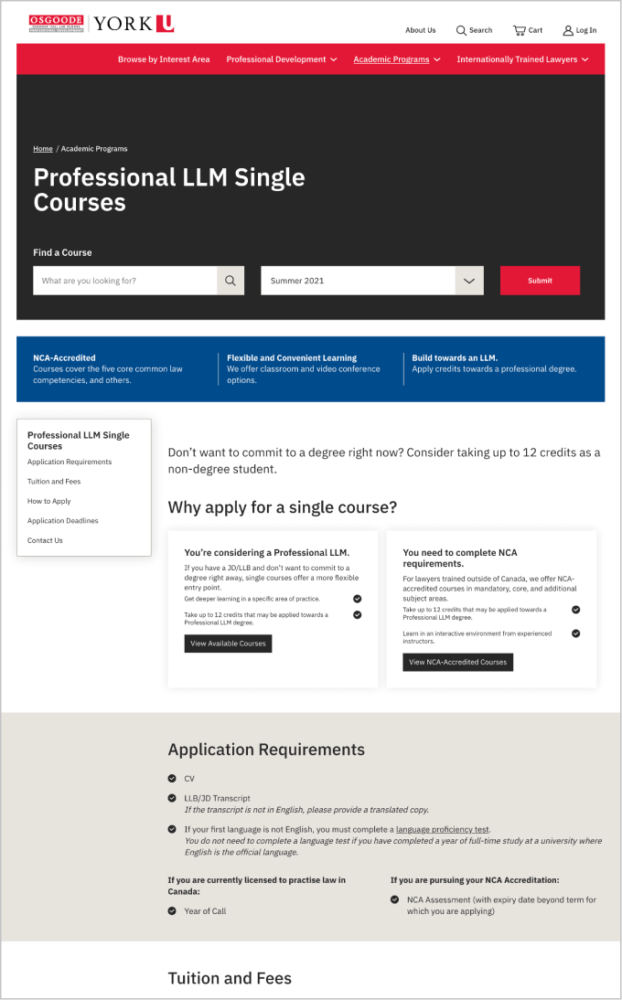
  • Defined site taxonomies and filter criteria to make programs, courses and other content more findable.
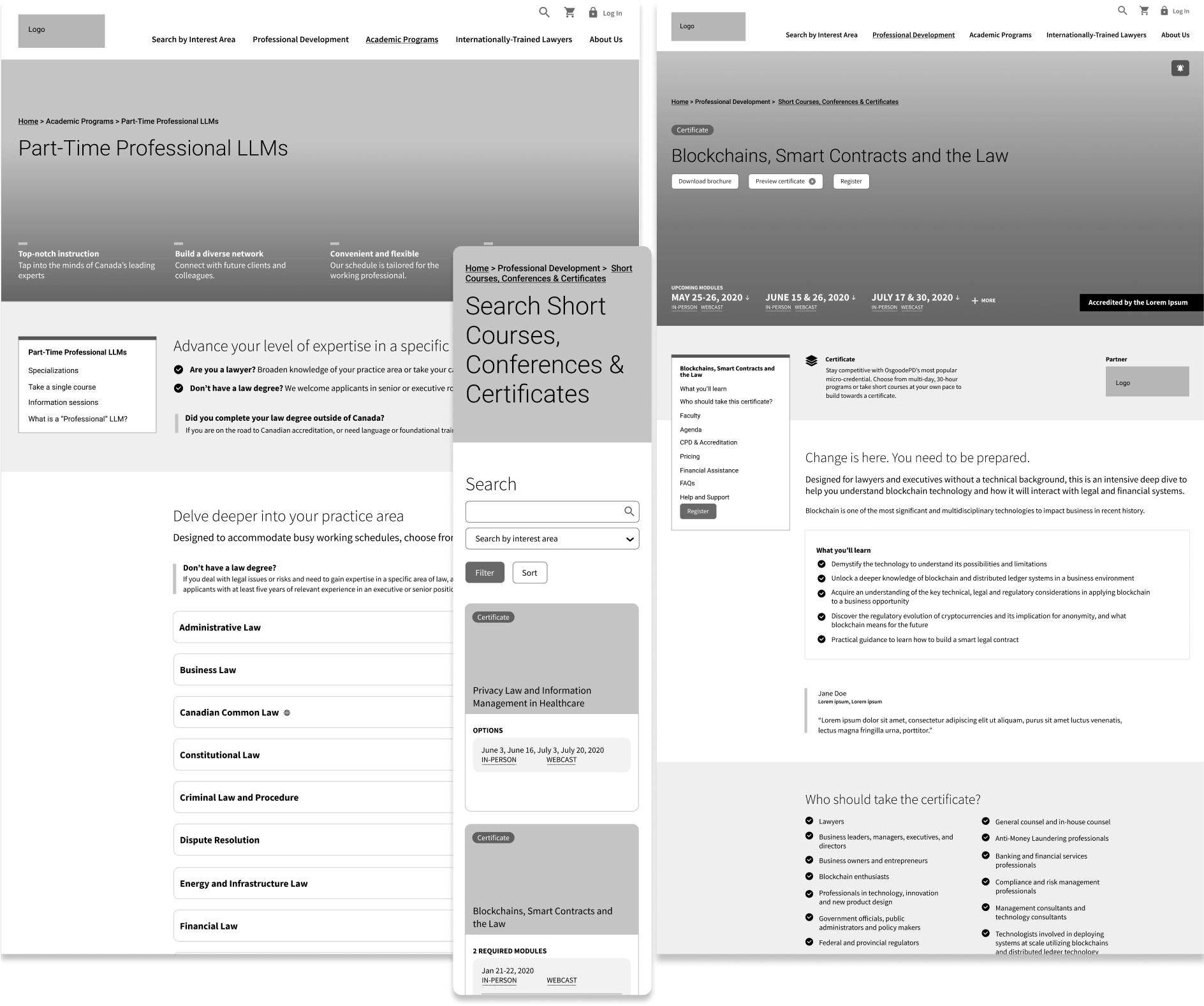
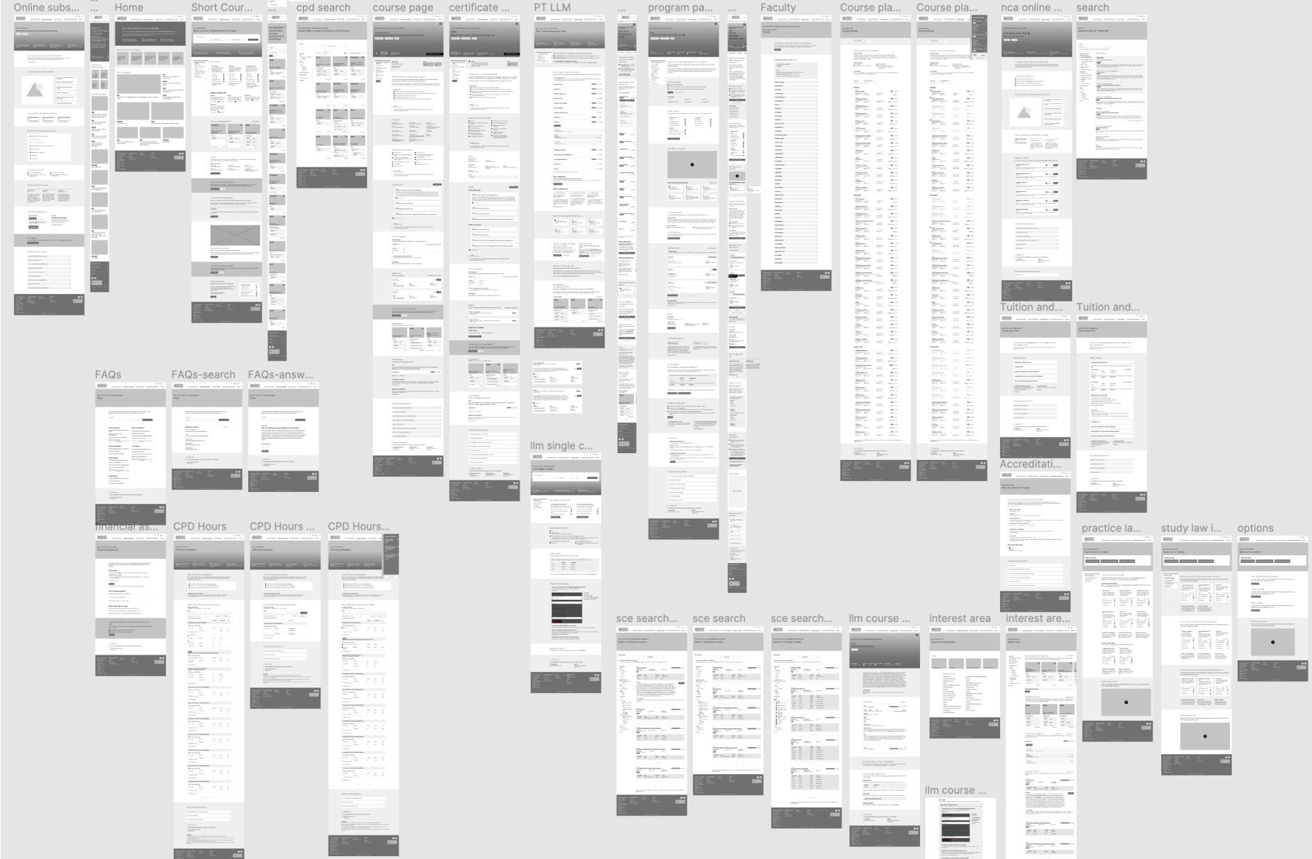
Various options for information architecture and navigation mocked-up
Options explored for navigation and information architecture

Wireframes

Wireframes are advantageous for many reasons; for our team, it helps us quickly block out a structure and see the user experience more holistically. For clients, it helps them better visualize our strategy and where content will live.

We involved our clients directly in the wireframing phase, scribbling and brainstorming to balance their vision with our strategy. Due to the content-rich nature of the site, we quickly moved into high-fidelity wireframes.
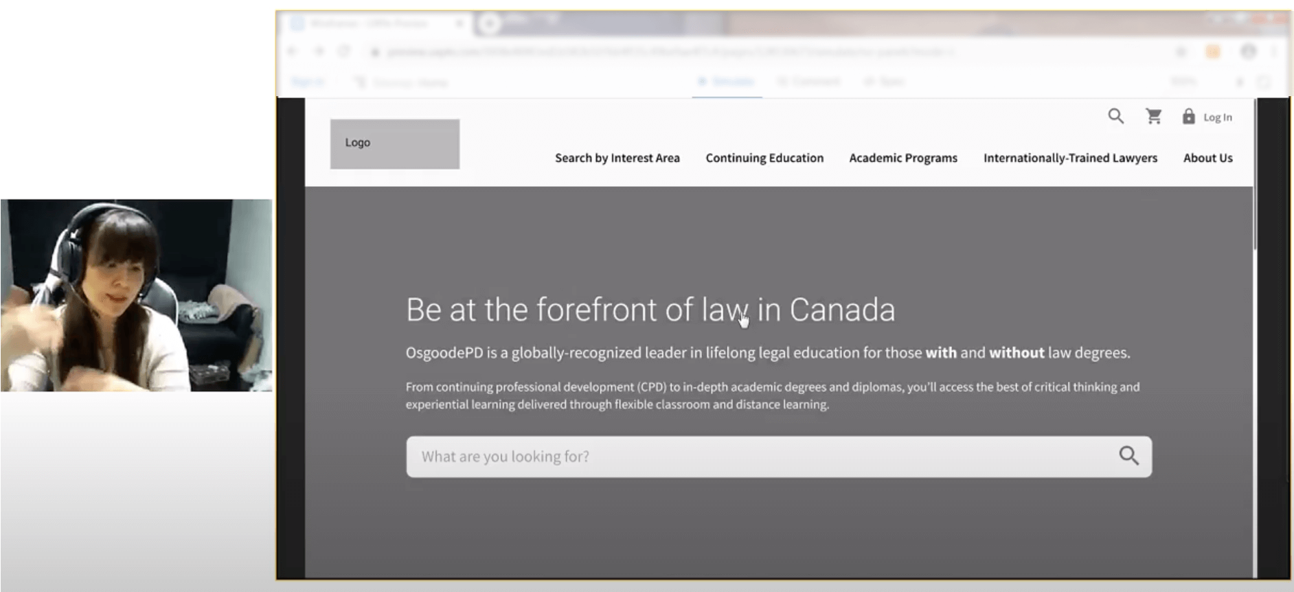
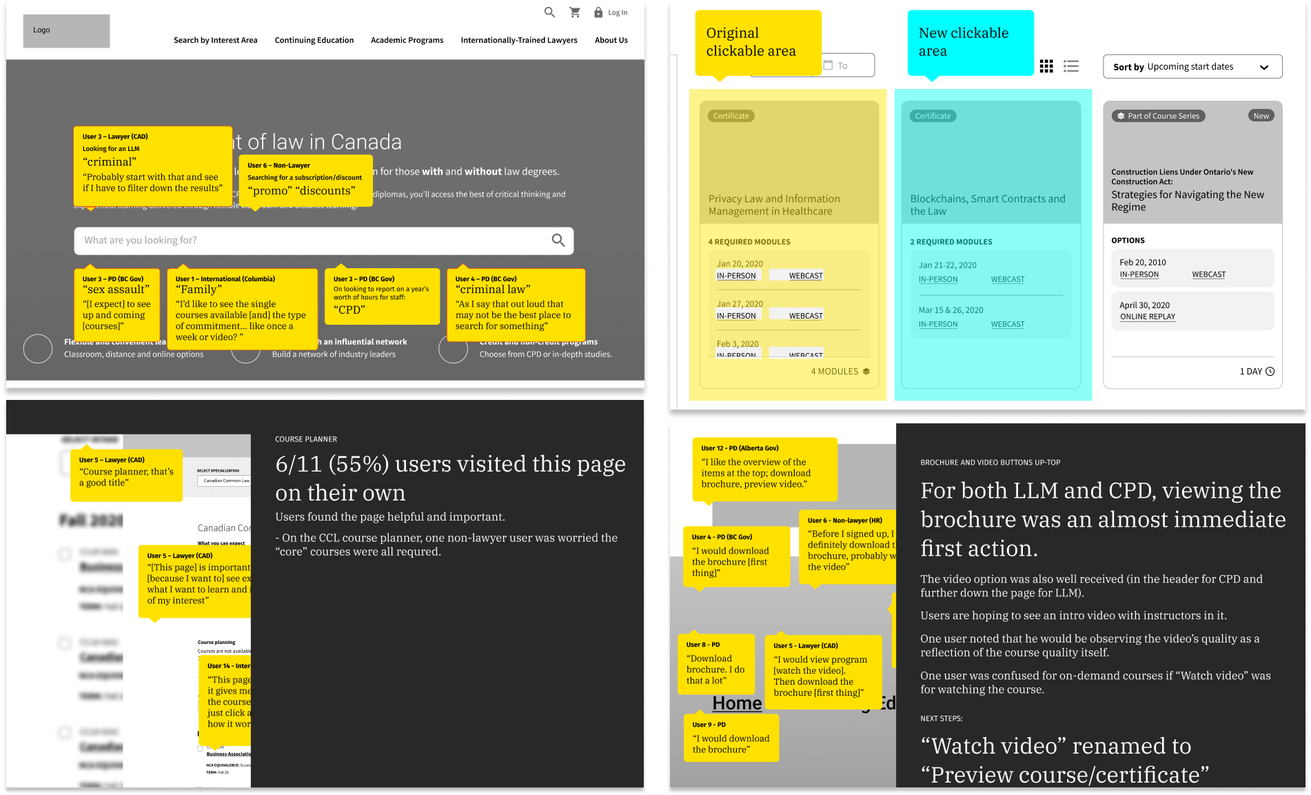
Wireframes of key webpages
Wireframes for some key pages
A view of a significant amount (approximately 37) of wireframed pages
A sampling of the extensive wireframing done for the site’s various pages

User testing

Our recommendations were based on comprehensive research; personas, user journeys, best practices and input from internal teams. But we wanted to make sure those who used the site would find it helpful and intuitive.

  • We tested the wireframes with 16 users representing unique segments.
  • Due to COVID-19, we adapted to facilitate and record sessions remotely.
  • Our testing was targeted, with tasks tailored for specific segments.
  • We turned insights to actions and recommendations for improvements.
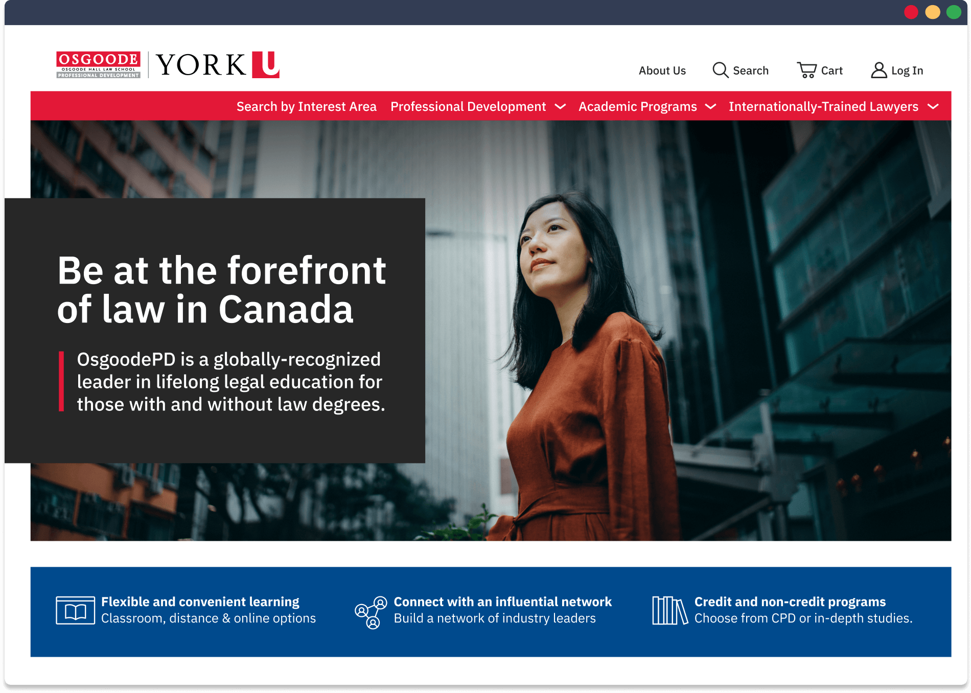
Context staff in a webcam with a wireframe of the site being tested on a user's screen
User testing conducted remotely by Context
Pages of a report with user comments overlaid on wireframes
Sampling of our user testing analysis and results document

Design

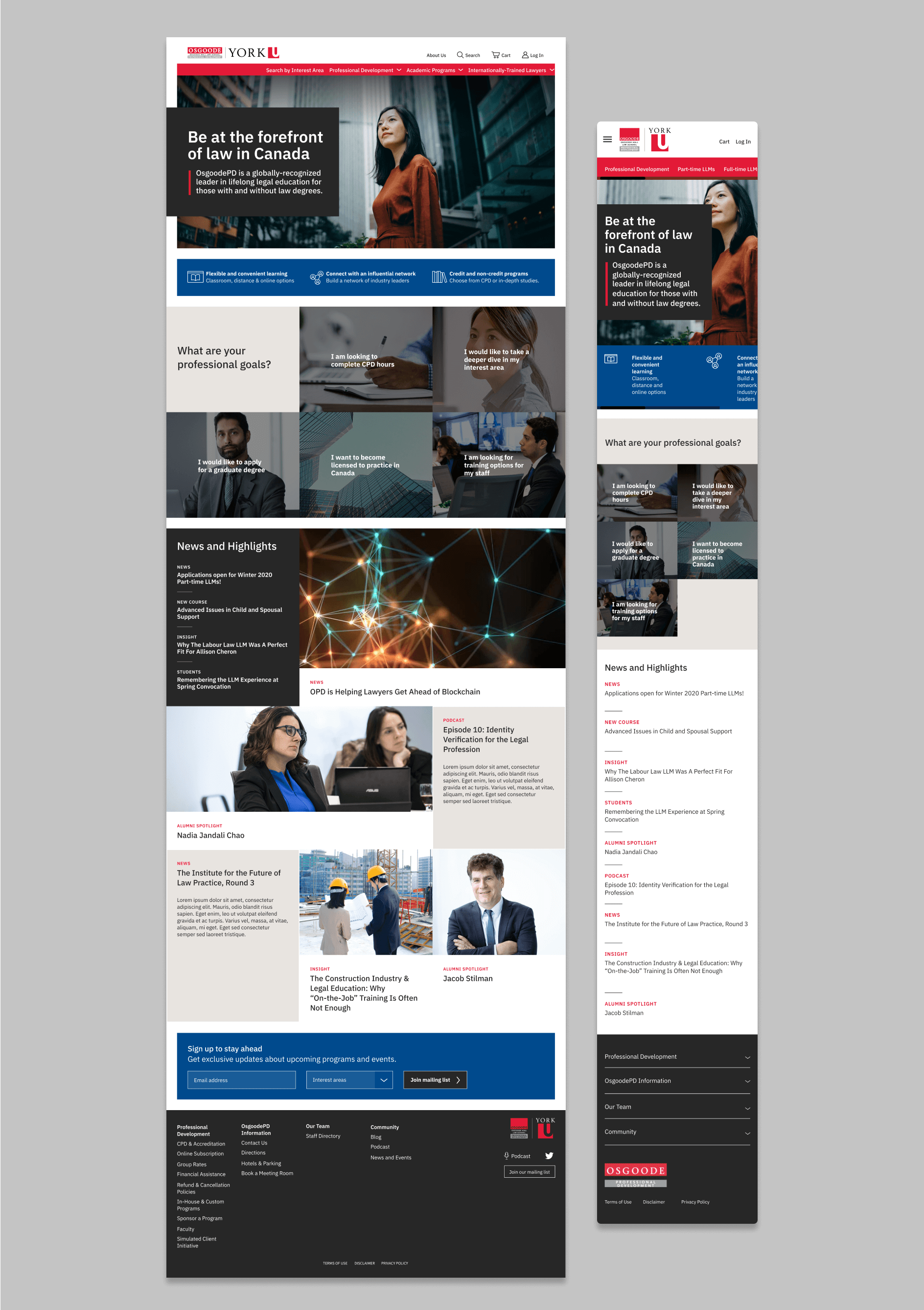
The design phase is always rewarding, when clients see their wireframes transformed into bold visuals and type. The design is modern and sleek to convey that OsgoodePD is at the forefront of its industry. With bold type treatment and tight grids, the site appears polished, professional and authoritative.

Full page of the Osgoode PD new home page on desktop and mobile screens
Home page
Professional Development Courses Landing Page Professional Development Course Search page Course page Part-time LLMs Landing page Canadian Common Law landing page LLM Course Planner page LLM Single Course Landing page LLM Single Course Search page

Development

On the front end, the site required a robust and user-friendly build to help users search and filter for relevant content. On the backend, it needed to be simple and flexible so that internal teams could easily update and create new pages. This presented a complex development process for our team, with extensive global components, complex functionality and highly detailed code.

Course modules were a project unto themselves, with distinct modules, formats, dates and departments. The site was a balance of complex logic and masterful code.

Collaboration was key to success

With clients as partners, we helped them lay order to complex streams of information to create a modern website that’s as intuitive for users as it is for internal teams.

Explore the OsgoodePD website

Trusted by clients providing vital public services, we step up to solve communication and design challenges that impact lives.

Let us help you solve yours.

Portrait of Lionel Gadoury, RGD

Lionel Gadoury, RGD, Principal, Director of Strategy and Creative Services

lgadoury@contextcreative.com

The latest from Instagram

contextcreative

Attending DesignThinkers? Join us in the lower lob Attending DesignThinkers? Join us in the lower lobby tomorrow at 8:15 a.m. for a roundtable discussion led by our Associate Creative Director Catherine Ryan. The topic will be "Beautiful, creative + accessible: Strategies for accessible design" See you there! #rgdDT

ID: Portrait of Catherine Ryan
Text on Image: RGD DesignThinkers 2024. I'm a roundtable moderator at DesignThinkers. Toronto, November 7 to 9.
Congrats to Carmen and Karen, winners of the @rgdc Congrats to Carmen and Karen, winners of the @rgdcanada Award for Accessible Design. Special thanks to Dave Hurds and the rest of the judges, too! Happy to sponsor this important category. 

ID: Three smartphones lay flat, side-by-side, each displaying different screens of GlucoPal, a diabetes tracking app, including a dashboard and journal feature.
Got a little messy painting ramps last week! Thank Got a little messy painting ramps last week! Thanks to @StopGapFoundation for hosting us—and all the work you do in creating more accessible spaces. 

#accessibility #AccessibleDesign #InclusiveDesign 

Image descriptions:
1. Ten team members in the alley with StopGap founder Luke Anderson, proudly showing off six freshly painted ramps.
2. Two team members paint a ramp in the woodshop.
3. Two team members paint a ramp in the woodshop.
4. Two smiling friends hold up paintbrushes over a ramp.
5. Two smiling team members hold up paintbrushes, as they put the finishing touches on a ramp.
6. Hard at work, two team members paint the surface of a ramp.
7. Context and StopGap Foundation teams standing in a row, showing off the new ramps in the alley.
The view from 116 storeys up. Should we make this The view from 116 storeys up. Should we make this part of our onboarding? #edgewalk @cntower
The results are in from our lakeshore cleanups wit The results are in from our lakeshore cleanups with @agreenerfuture 

- 9 volunteers over 2 events
- 6,487 pieces of litter collected
- 720 pieces of litter each on average
- 2,331 cigarette butts
- 1,817 plastic pieces
- Protected 2,331,000 litres of water from contamination
- Prevented 24 lbs of plastic from being ingested by wildlife
- Diverted 8 lbs of plastic waste from Lake Ontario

#buttblitz #loveyourlakes #volunteer #plasticpollution
These lovely volunteers pitched in today at the No These lovely volunteers pitched in today at the Norseman Community Food Bank in Etobicoke. Thank you to NCFB and  @DailyBreadTO for all you do for our community!
Load More Follow on Instagram
  • Medium
  • Instagram
  • Twitter
  • Work
  • Services
  • Team
  • Careers
  • Insights
  • Accessibility
  • Contact

Context Creative — a Mod Op company

172 King St. E., Suite 300, Toronto, ON M5A 1J3

© 1993 Context Creative All rights reserved. Privacy Policy