Making it easier for Canadians to find benefits
In collaboration with Prosper Canada
Comprehensive UX evaluation and improvements made a wayfinding tool more accessible.
Challenge
To help more low-income Canadians access government benefits more easily.Solution
A comprehensive UX and accessibility strategy, informed by users.Tactics
Heuristic evaluationAccessibility audit
User testing
Wireframes
UX design
The context
Government benefits are important financial supports that can be a lifeline to enhance quality of life. But many Canadians are either unaware that they’re eligible, or encounter significant barriers along the way. When you need to prove your disability over and over, submit complex paperwork or navigate confusing eligibility requirements, it’s easy to become overwhelmed—or even give up.
As a national non-profit organization that expands economic opportunities for low-income Canadians, Prosper Canada develops resources and digital tools to help more people thrive.
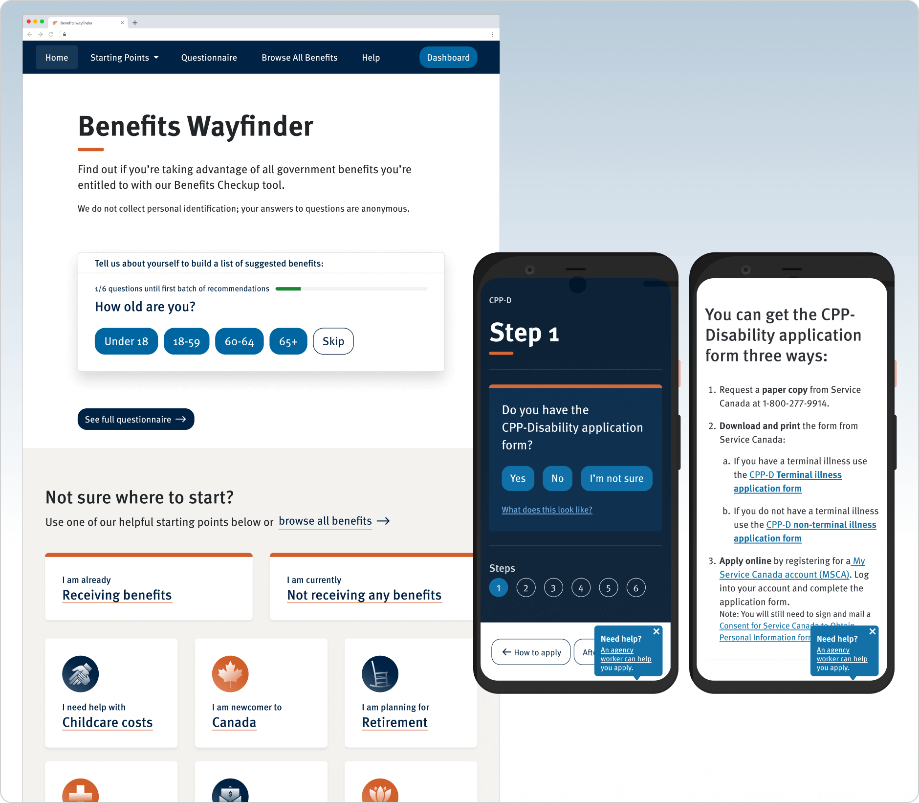
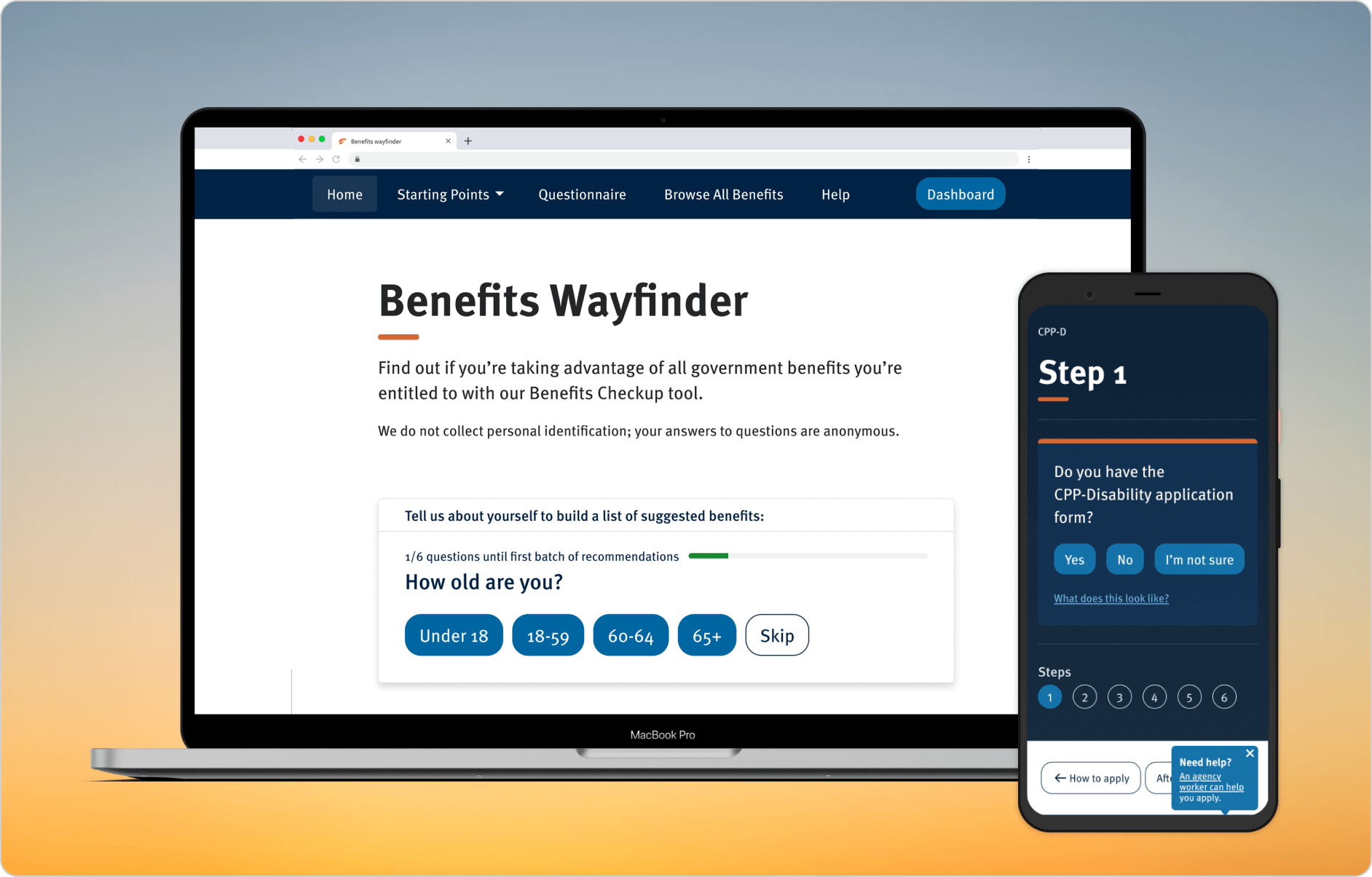
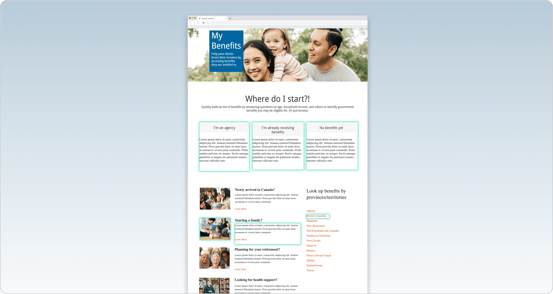
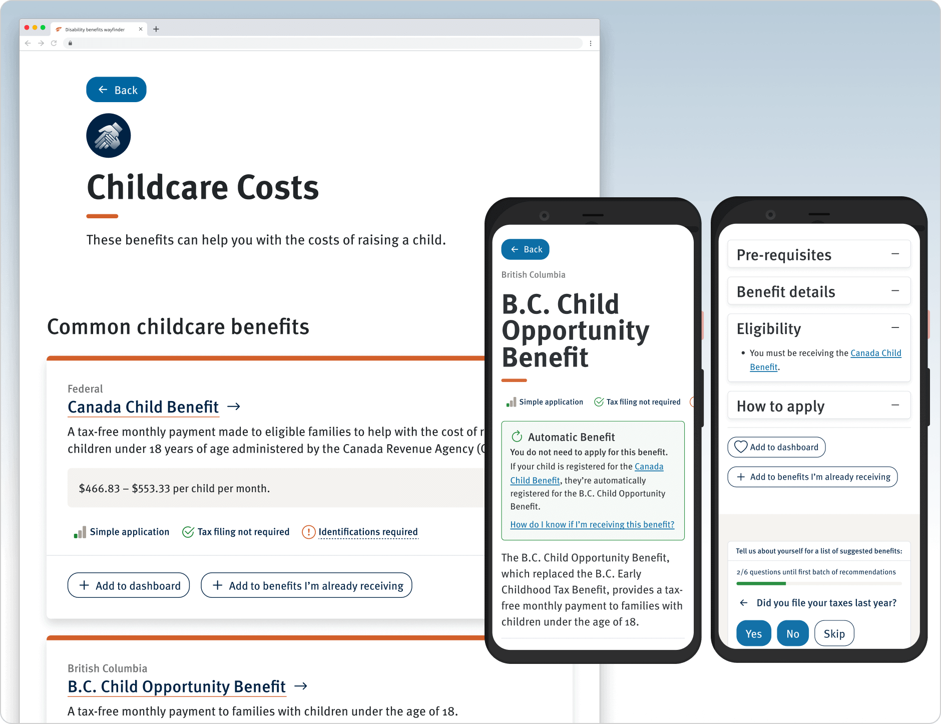
The Benefits Wayfinder is a free online resource that aggregates hundreds of government benefits, while the Disability Benefits Compass provides guidance on applying to four key disability benefits. Prosper Canada wanted to evaluate the usability and accessibility of each tool to make it easier for users with diverse needs to access benefits.
Empathetic design for diverse user needs
Our challenge was to ensure that both the Benefits Wayfinder and Disability Benefits Compass could accommodate a variety of users with diverse backgrounds, abilities and needs.
We began with a review of two distinct modules within the tools, online prototype and code base. Next came a heuristic evaluation of the prototype, alongside an initial accessibility audit and usability review. With our findings in hand, we updated the prototype in preparation for user testing.
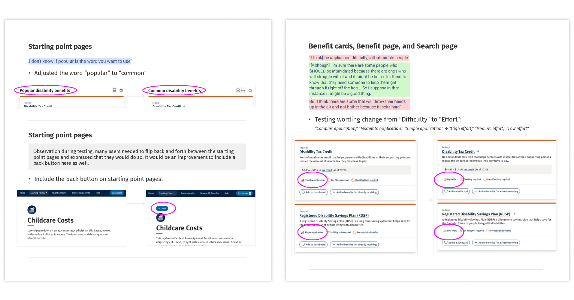
Hearing directly from users
We also wanted to ensure we understood how users currently used the resource, particularly underrepresented groups. Through a series of focused user tests—including remote testing and firsthand interviews via videoconference—we identified:
- Potential pain points for specific user segments, such as newcomers or people living with disabilities.
- Ideas on how to most effectively engage and retain users.
- Which new features and opportunities would help meet or improve upon KPIs.
- Design engagements to improve user experience and make content updates more efficient.
With tight budgets and timelines, we also had to navigate multiple layers of input and feedback from relevant teams and ensure all needs and priorities were clearly understood and captured throughout the process.
Improvements and outcomes
Based on insights from users, we developed new wireframes and mockups to improve the tool and seamlessly integrated them. The improvements included:
- A simplified step-by-step questionnaire to identify eligible opportunities.
- Streamlined application process information.
- More plain language for increased accessibility.
- Multiple ways to browse benefits, including self-identification based on key groups.
- Improved navigation from a streamlined design with ample white space, content blocking, and hierarchy.
Ultimately, the one result that really matters is: can users access benefits?
In the first 18 months after launch the UX and accessibility improvements resulted in:
- Over 231,000 unique (new) visitors, across all provinces and territories.
- Over 93,200 dashboard sessions created.
- Over 84,000 questionnaires started.
- A customer satisfaction score of 8.03 (Average Net Promoter Score out of 10).